As I reflect on my years of experience as a CMO, I’ve witnessed the evolving role of Gantt charts in Excel firsthand.
From not just being a spreadsheet framework, Excel has expanded its functionality to be a budget-friendly tool in project management.
With skillful manipulation of formulas, these Gantt charts can be customized to enhance your experience to new heights.
Great, right?
So, if you want to learn to make Gantt charts in Excel, I’ve shared the steps you can follow to define your project schedule, track project progress, and identify bottlenecks early on.
Let’s dive in!
Are you tired of Excel and looking for alternatives? Explore better options now!
What is a Gantt chart?
Gantt chart is a project management instrument and a type of bar chart to have a total overview of the projects and tasks in a single glance. It is a great visualization and prioritization tool to manage projects, plan schedules, optimize resource efforts, and track project progress with better clarity and understanding.
Developed by Henry L. Gantt in the early 20th century, the two-dimensional matrix places the task list on the vertical axis and the horizontal axis representing the project timeline. It is a perfect navigator for planning, scheduling, and decision-making processes.
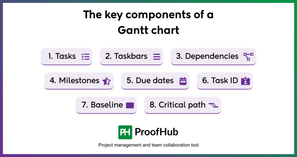
The key components of a Gantt chart include –
- Tasks – The Gantt chart list, a column of all the tasks, subtasks, and milestones, is shown on the left of the screen. So, that you can overview your entire work schedule, this particular section includes task descriptions or details, like start date, end date, duration, constraints, etc.
- Taskbars – Task bars also called Gantt bars, are the horizontal representation of individual tasks and their length corresponds to the time frame within which each task should be completed. The shaded portion of these bars signifies the overall progress of a task.
- Dependencies – Considering the dependencies between multiple tasks and subtasks, the Gantt chart helps you visualize these relationships clearly. As the termination of one task prompts the start of another, understanding these task dependencies represented by small arrows between taskbars becomes pretty simple.
- Milestones – Milestones are the key tasks on which the accomplishment of an entire project is hinged. Consider these tasks as significant events that foster a sense of achievement and are represented by different shapes, usually a diamond icon in a Gantt chart.
- Due dates – Shown at the top of the graph, this parameter is a crucial aspect of a Gantt chart. Since these not only define the start and end date of a project but highlight the overall timeline of a project schedule.
- Task ID – Since numerous projects are run side by side, distinguishing one task from another is a feat you can achieve with task IDs. This helps identify the task involved in your discussion.
- Baseline – Analyzing the project’s deviation from the original project plan, is a critical task you can perform with a baseline to keep your projects on track. It is a vital parameter to identify the actual progress.
- Critical path – Critical path is a sequence of tasks that can not afford any delays or flexibility, to avoid unnecessary project delays. These tasks need to be completed in time to meet project deadlines.
Why make a Gantt chart in Excel?
Creating a Gantt chart in Excel has long served as the backbone of project management.
And this collective data representation in the Gantt chart – with a spreadsheet on one side and visual representation on the other, is still relevant now.
How?
Because many teams still rely on its versatility to stay on top of their project operations.
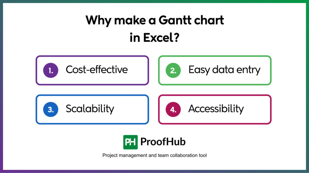
Here are some of the key benefits of building a one in Excel –
- Cost-effective – The straightforward and budget-friendly solution comes as a part of the Microsoft 365 suite and does not include any associated additional cost to burden your pocket.
- Easy data entry – The grid overview of Excel permits adding task descriptions, start dates, end dates, duration, and more in a simplified manner, making it easy to have a consolidated overview of project details – both numerically and visually.
- Scalability – The flexible framework of Microsoft Excel caters to the needs of businesses of all sizes in managing and building Gantt charts of every project length. However, it is highly recommended for small and simple projects.
- Accessibility – The Gantt charts in the Excel table can be stored as Excel files. Being highly accessible on various platforms and devices, contributing to the overall project by teams and stakeholders becomes so simple.
If you’re still unsure about Excel’s suitability for your needs, check out these best Excel alternatives to enhance productivity and efficiency.
How to create a Gantt chart in Excel?
Creating a Gantt chart in Excel with a built-in option is not possible so far, and using a stacked bar graph in Excel is the only possible solution to consider.
Here are the simple and straightforward steps you need to follow to get started with Gantt charts in Excel.
Let’s check it out.
Step 1 – Create a table of your project information
Start by opening a new Excel file, and fill in your entire project details in the table format.
The details you need to put in must include:
- Task names (or task descriptions)
- Start date
- Completion date
- Task duration
Since your start date is in column B and the end date is in C, you need to apply the formula C2 – B2, to calculate task duration. Copy it to all the remaining data cells.
Step 2 – Add a stacked bar chart
Now you need to select the Task name, Start date, and Task duration (using a control key) as the base for your Gantt chart.
With all this data selected, click on the Insert menu on the Excel ribbon, followed by clicking Recommended Charts.
From the Insert chart dialogues box, select the Bar chart type and from there click on the stacked bar chart.
On clicking OK, a chart will be inserted on your screen.
Step 3 – Format the graph chart
You’ll see your bar chart to be pretty basic, so, it’s time to make it a little better.
For that,
- Double-click on the blue section and a Format Data Series pane will appear on the right side of the window.
- Among all the Series options, choose the paint bucket.
- From Fill selection select no fill and from Border down below choose no line.
It’s definitely turning into a Gantt chart, but still not up to the mark.
Now you’ll see the task list on the left of the chart is not in the exact same order. To bring it to the order,
- Double-click on the task list.
- From the pane on the left, select Format Axis.
- Within the axis options under the Axis position, check off the Categories in the reverse order.
Here we get a properly aligned task list.
After that, you’ll see the dates have moved upright on the top of the chart and are knocking over each other. To make them more distinguishable,
- Select dates.
- Go to the alignment category in the Home tab.
- Angle the text in whatever way you want.
You might notice a gap on the left side of your chart
To make the Gantt chart fix the entire space, adjust the Start date (Minimum) and End date (Maximum) under the Bounds section.
Step 4 – Give the Gantt chart a title
That’s the simplest of all the steps done above.
- Just click on the Chart Title, at the top of your Gantt chart.
- Name the title or use the one already defined.
That’s just it.
All done and dusted!
Despite not having a built-in Gantt chart option, you still can make a Gantt chart from a simple bar chart.
But if you don’t want to go all over these crazy processes, you can directly skip it and build one using templates.
Gantt chart Excel templates
Don’t want to do all the hustle to make a Gantt chart from scratch?
The visual and ready-to-use templates available in Excel are here to give a professional shine to your project management practices.
These standalone project management documents are easy to step into and equally simple to adapt to.
Just pick the Gantt chart template of your choice and get started in a flash.
- Gantt project chart template
Want a ready-made Gantt chart for your projects?
Just add in your activities and the progress will be adjusted automatically.
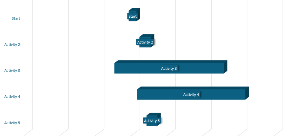
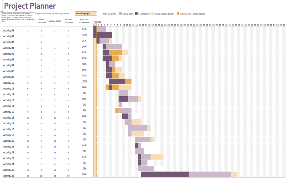
- Gantt project planner template
Use this built-in template to lay out your project plan to have a visual representation of task progress.
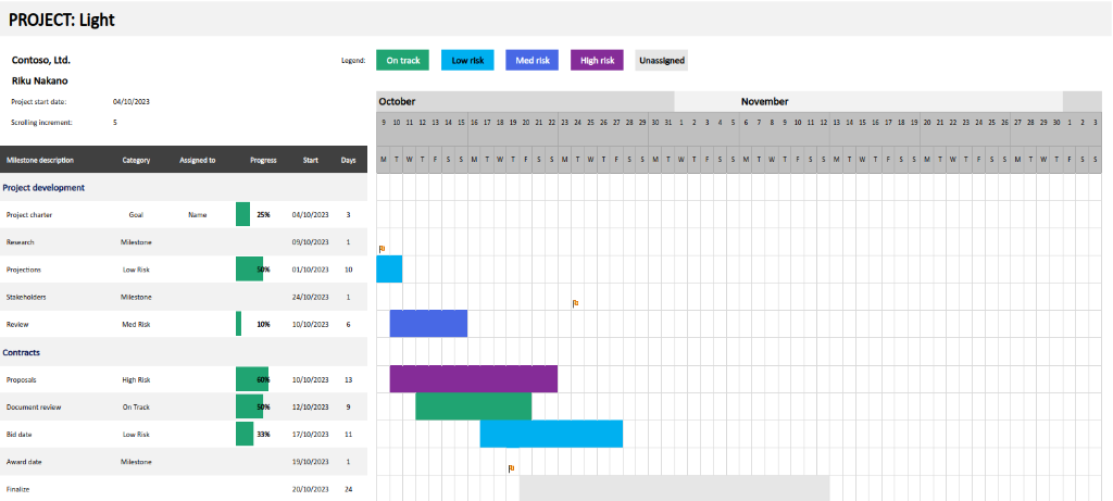
- Agile Gantt chart
Based on the concept of agile methodology, this color-coded template is ideal for agile teams to analyze the current status and gauge the pace at which task execution progresses.
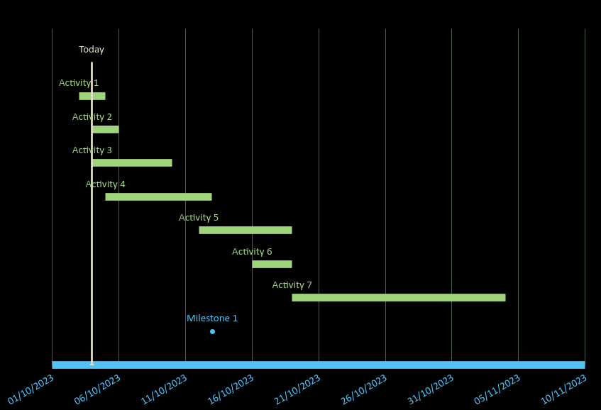
- Data tracker Gantt chart
If you’re seeking a touch of automation in your project management, this highly customizable template automatically updates the Gantt chart upon entering the data.
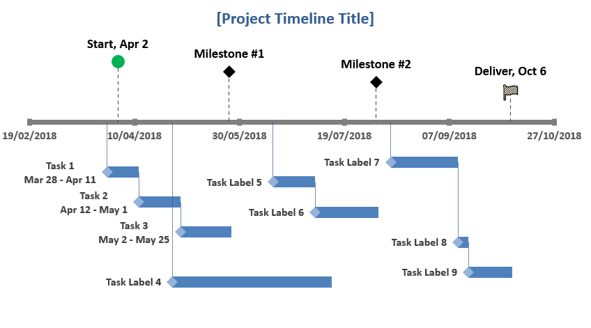
- Milestone and task project timeline template
Need a comprehensive project milestone template?
Set task dependencies using scatter tools and organize milestone and project timelines altogether.
If you want to explore more, many websites like Oragescrum, Templatelab, and more offer built-in templates.
Explore the perfectGantt chart toolsfor your business.
Drawbacks of an Excel Gantt chart
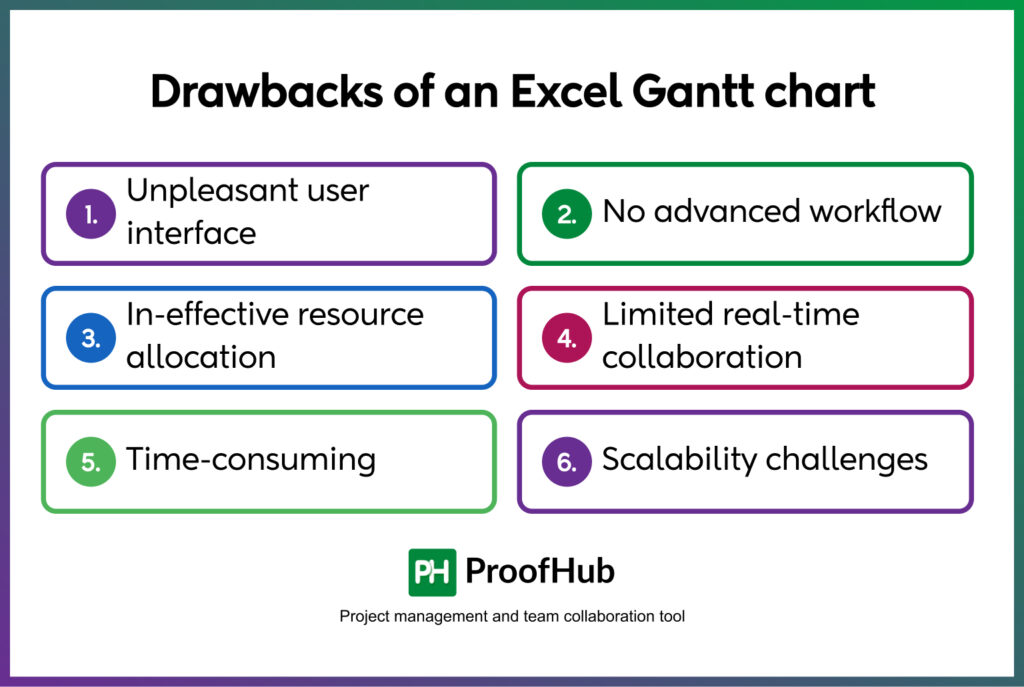
Having said that Gantt charts in Excel have been the choice of many to plan and track projects, but does it stand the test of time?
Probably yes, but to what extent exactly?
Does it suffice the complex and ever-evolving project management demands with ease?
For sure, No!
Let’s delve deeper and find out how Excel Gantt charts fail to compete with robust project management software.
- Unpleasant user interface
What do you see when you get into Excel?
I see a dull and monotonous grid of rows and columns with endless cells to fill in the data.
And creating a Gantt chart in Excel is no less than a hassle.
You need to remember every functional formula to get even the slightest of work done.
Ughhh, such a pain!!
- No advanced workflow
These free-of-cost chart sheets offer basic project management features but lack many advanced features, such as critical path analysis, collaboration features, real-time updates, and more.
And if we talk about its built-in suite, even they do not necessarily promise advancement in operations.
Take, for example, the procedure of setting a baseline.
I mean, why go through such a complicated process to compare the actual schedule to the current one, when you can do it with much simplicity using a dedicated project management tool?
- In-effective resource allocation
In the name of resource allocation, Exel Gantt charts allow you to simply assign tasks to the team members.
Also, the more you want to add assignees to a task, the more the number of columns multiplies, like “Assignee 1”, “Assignee 2”, and “Assignee 3.
And to define their roles and responsibilities, you probably need to make one extra column.
Too many columns for a simple task !!
- Limited real-time collaboration
With no built-in collaboration features, real-time interaction on Excel Gantt charts is impossible.
The limited collaboration features like threaded comments, permissions, and more confine your ability to keep an account of previous revisions.
Also, with the absence of a version control feature, you can not track the changes made by another person until saved.
Basically, more confusion and comments.
- Time-consuming
Did you see the how-to guide above?
You can see clearly how cumbersome making a Gantt chart in Excel is.
And if you are tasked with creating and maintaining a complex Gantt chart, adding details manually, and relying on crazy Excel Gantt chart formulas to stuff in bar chart from the spreadsheet data, can actually take a toll on you.
- Scalability challenges
Excel spreadsheets limit their handling to 1,048,576 rows and 16,384 columns, but what if you need to go beyond its capacity?
Then what?
Also, all the manual data feeding and setting dependencies between a large number of tasks and subtasks, without the simplest drag-and-drop functionality makes it incredibly overwhelming.
ProofHub Gantt chart software: The best alternative to Excel
Now if you’ve been convinced to leave Excel Gantt charts behind and upgrade to an easy-to-use Gantt chart software, ProofHub can make this transition seamless for you.
The powerful platform takes into account the complexities of managing larger teams and projects and is loaded with features and functionalities to manage projects with little to no time investment. Because
Excel despite being free, costs you TIME.
It equips you with the ability to analyze if the projects are in sync with the defined timeline and allows you to modify dependencies and workflows when deadlines shift or circumstances change to keep them on track.
Let’s get into the details to understand how ProofHub overcomes all its limitations with the finest capabilities-
- Intuitive user interface – Also, apart from being visually attractive, the platform’s interface is intuitive enough to offer seamless navigation for users.
If in case, you want to remove any task from the workflow, it will automatically adjust the dependencies on its own. You don’t have to do all the hustle again.
No matter the number of task lists, tasks, or subtasks, monitoring the stage-wise progression of the entire task flow is handy with ProofHub.
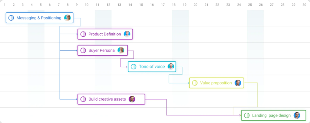
- Advanced task management – ProofHub’s visual Gantt software with its robust features surpasses Excel to help you clearly identify every intricate detail of your project and the impact it can have on your overall project.
You can visualize the overlapping activities, organize the complex projects, and overall project overview to make better decisions and modifications.
Not only this, with Gantt charts you can even spot bottlenecks in time and take corrective actions to save the project from derailing.
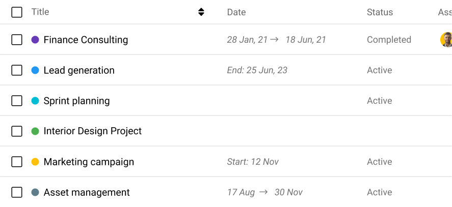
- Efficient resource allocation- The Gantt chart provides you with a clear indication of time estimates to precisely gauge the time required to complete the task.
This way you can appoint the right and sustainable proportion of sources needed upfront, utilizing the manpower in your team to the fullest.
No one is overburdened or underutilized – just the right allocation for successful project completion.
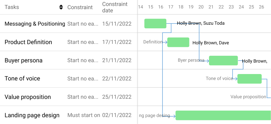
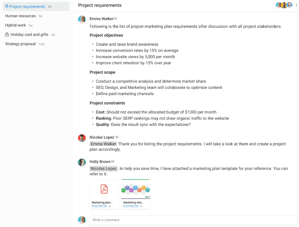
- Real-time collaboration- To ensure that your team is on the same page, ProofHub’s Gantt chart creates a clear picture for everyone.
It entitles everything from task progression to timeline, fostering transparency and accountability among teams displaying up-to-date information.
Moreover, if your team wants to have a quick brainstorming session or share documents, they can do so with a built-in chat to have one-on-one or group conversations.
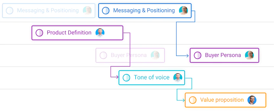
- Better time management – The timeline overview of ProofHub eliminates the need to implement formulas to achieve a desired output.
All you need to do is just add your task details and get a unified overview of the same in the Gantt chart view.
And if you need to make any modifications to your project plan, just drag and drop them without undergoing severe complicated processes.
- Scalable and flexible – As the teams grow, so does the number of tasks and projects. And along with that, the number of Excel sheets.
But, let me assure you here, that no matter your task size or numbers, ProofHub’s scalability is not limited to any specific threshold, unlike Excel.
Also, ProofHub’s flexibility is another aspect that sets it above Excel, which is too rigid in its structure. In fact, you can customize your workflow to suit your requirements with simplicity and ease.
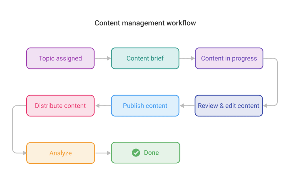
Manage tasks and workflow on ProofHub’sGantt chart softwarein a snap.
Excel your Gantt chart game with ProofHub
Microsoft Excel has enjoyed the fandom for a long and is still recognized as the most versatile tool for businesses all around.
But does the Gantt chart in Excel offer extreme supremacy?
It’s only a dedicated project management software with flat-fee pricing like ProofHub that eliminates the hassle of creating Gantt charts and simplifies project management.
From planning, managing, reporting, and consolidating your project data, everything is here – all under one virtual roof.
ProofHub’s Gantt view empowers you to stay compliant with its user-friendly interface and helps you remove any kind of obstacle to keep all the parts moving like a well-oiled machine.
FAQs:
Does Microsoft Excel come with a Gantt chart template built in?
Yes. A basic and built-in Gantt chart template is available in Microsoft Charts. However, multiple free and paid Gantt charts are available online on websites like TemplateLab, Orangescrum, and more.
How to create a Gantt chart in Excel with start and end dates?
To create a Gantt chart in Excel, you can either use a built-in template directly or build it from scratch following these steps.
- List down the intricate information of your project like task description, start date, end date, and more in separate Excel table columns.
- Select the details you want to add to the Gannt chart by adding a stacked bar chart from the Insert menu on the Excel ribbon.
- Using Format Data Series, upgrade Your Gant chart the way you desire.
- Give your Gantt chart a title.
To know in detail, click here.
Why should I use a Gantt chart in Excel?
Excel Gantt charts are budget-friendly solutions for your project management needs. So, if you do not want to add an extra layer of cost to your expenses, nothing beats them.
Which tool is used for the Gantt chart?
Many Gantt chart software are available in the market, but ProofHub Gantt chart software beats the competitors to take the leading spot in the list.
